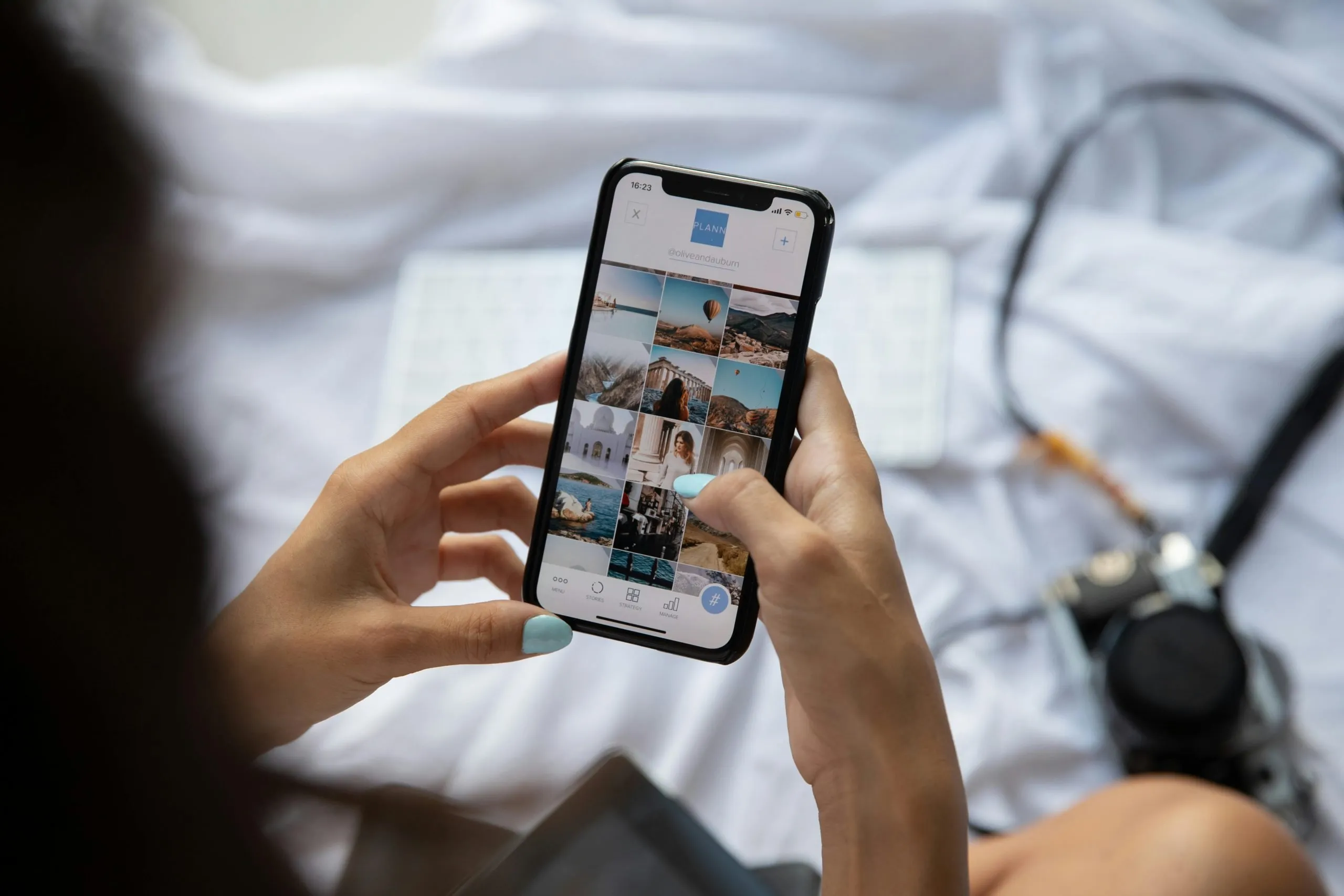
As anyone with a smartphone or tablet can attest, the way we use our mobile devices has completely evolved over the last decade. As screen time increases and we find ourselves scrolling and tapping for hours, the way we use the internet has and will continue to change in a big way – until desktop browsing is no longer the most popular choice, a reality we are practically rocketing towards.
Gone are the days where websites were designed and optimised around a desktop screen. It is necessary now to consider, maybe even prioritise, the mobile viewing experience to ensure that your users can navigate your website with ease. Not only has the use of mobile devices increased, it has become expected that websites are designed with these smaller screens in mind, and if you don’t design your website around mobile devices you could be alienating a large portion of website users.
So, how do businesses keep up with this steady swing in favour of mobile browsing? With responsive website design.
To understand why responsive web design is so crucial, let’s break down what exactly it is.
The key element of responsive web design is in its name – responsiveness. A good responsive web design reacts to the device, whether that be a mobile phone, tablet or desktop screen. To be truly responsive, the website will change depending on the screen size to ensure the best user experience. To achieve this flexible design, most designers will opt for grids, layouts and images that are created around responsiveness. It is common to use CSS media queries to ensure your website is adaptive, responsive and optimised for any screen size or device. CSS media queries allow you to develop responsive web applications.
To see an example of responsive web design in action, let’s take a closer look at the Immerse Marketing website. When we consider what makes a website responsive, you can see how the layout on mobile differs from the desktop design. The mobile layout has a navigation bar better suited to a hand held device, while the desktop menu is easily accessible on a larger screen. The size of the images changes, as do the scrolling elements. This is the power of responsive website design in action.
If our website was not built to be responsive, you would instead have to deal with desktop focused elements on a small screen – awkward and difficult, you’d likely not scroll very far.
If we had to answer this question in 18 words and 104 characters, we’d say that responsive web design is so popular because it makes websites easier to use and makes browsing more fun. But luckily, we have more words than that.
Responsive web design goes above and beyond usability. While the UX of a website is incredibly important in regards to user retention, it also affects your reputation. Businesses who have outdated, unresponsive websites are much less likely to be recommended by visitors. This is exactly why responsive web design, and web design as a whole, is so much more important than many businesses realise. No matter if you’re selling a product, a service, or simply offering information, if your website isn’t nice to look at and usable on a mobile device you will not be recommended or prioritised.
It really is a world of endless choice for customers online. One google search will yield thousands of choices, and your potential client will jump between websites on their device of choice until they find one they like. To make sure it’s your website they stay on, use the below information to build the responsive website design to knock their socks off.
Many web developers will remember the archaic days where websites were designed using fixed widths, meaning the proportions were the same no matter how big your desktop screen was. I am sure we are all glad to see those days in our rear view – time to focus on the future of web design, which is a mobile first approach to responsive design.
Adaptability is the foundation of responsive website design, as websites that are designed to be responsive will move fluidly and fill any screen size. Simply resize your browser window on your desktop and you will see responsive design in action (on most websites, we can’t promise this test will always work).
The superstar of responsive web design, if you ask any developer, is media queries. Think of media queries as questions you can set your website to ask the device before loading. Just a website and mobile device having a chat to make sure images, information and the overall design adjusts to the screen it is being displayed on. They probably don’t also talk about the weather but, you never know.
There are endless benefits to responsive web design, but here are some of the main ones:
Reap the benefits of responsive website design yourself with Immerse Marketing in your corner. Our team build, design and maintain customised websites to suit your needs, designed to be responsive and adaptable for businesses of any size. Check out our portfolio and see for yourself why so many businesses choose Immerse Marketing.
Website developers strive to make accessible, user friendly websites that are as beautiful as they are functional. Responsive web design is, in turn, a developer’s best friend.
To ensure that your website is as responsive as can be, there are a number of core elements that come together to create the ultimate website – think like Transformers, but better.
The crucial elements of responsive website design are:
You will need to test your website on different devices and screen sizes before going live. Understand that there are some limitations, and while responsive design can basically do it all, you want to be sure it doesn’t come at a cost to other areas such as the speed of your website loading. Testing your new responsive website can take some time, so be aware to leave some time aside to make sure you work out any bugs or kinks before going live.
If there is any doubt about the solidity of the future of responsive design, quell it now. Responsive web design has made its mark and is here to stay. With such effective results, and the data showing mobile devices are becoming the most popular choice for web browsing, you simply cannot deny the power and necessity of responsive design.
The future will see responsive websites become the default, and with this even more powerful and adaptable options will become available. Media queries will continue to be the easiest way to achieve these new and improved ways of creating responsive websites, as they talk directly with the device to decide how the site will display.
While no one can predict the future with 100% certainty, we can see a world where smaller, mobile screens become the benchmark for all website design. Mobile first, desktop second to ensure that the highest traffic source – mobile users – are happy and comfortable navigating your website.
We highly recommend a design check in and refresh for your site, especially for websites that are 5 years or older. Reach your target audience and ensure they like what they see with a responsive website created by Immerse Marketing.
A well designed website is your very best tool for finding clients, increasing brand awareness and educating users. Make sure anyone who clicks onto your site is immediately interested, thanks to your responsive and user focused website design. Beyond usability, Google’s algorithm boosts websites with responsive elements – allowing you to remain one step ahead of any competitors.
At Immerse Marketing, we have a team of experienced and professional website developers and designers to create you your very own online masterpiece. We know what it takes to build the foundations, focusing on SEO, usability, responsiveness and overall user experience. Enjoy all the benefits of a custom website alongside the many benefits of a responsive website design, and you’ll notice the changes in website traffic and user retention from Day 1.
With great design comes great responsibility. At Immerse Marketing, all you get is great design – and don’t worry, we’ll handle the responsibility part too. Enjoy seamless software integration, compelling content, ongoing maintenance and more when you choose to build a responsive website with us.
Visit our website and check out our portfolio to see our previous web design work. Contact us with your questions, or submit a query if you want to get your responsive website journey started! We can’t wait to hear from you.